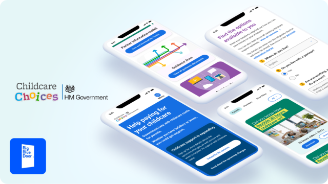
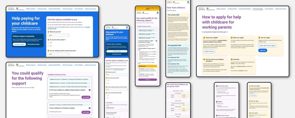
Childcare Choices site redesign
UX, UI, Prototyping, Design System, Figma, LocalGov Drupal
Role
Senior Product Designer
Timeline
2 months
Responsibilities
- Research and insights
- Mapping business and user goals
- Brand and foundations
- Design and prototype
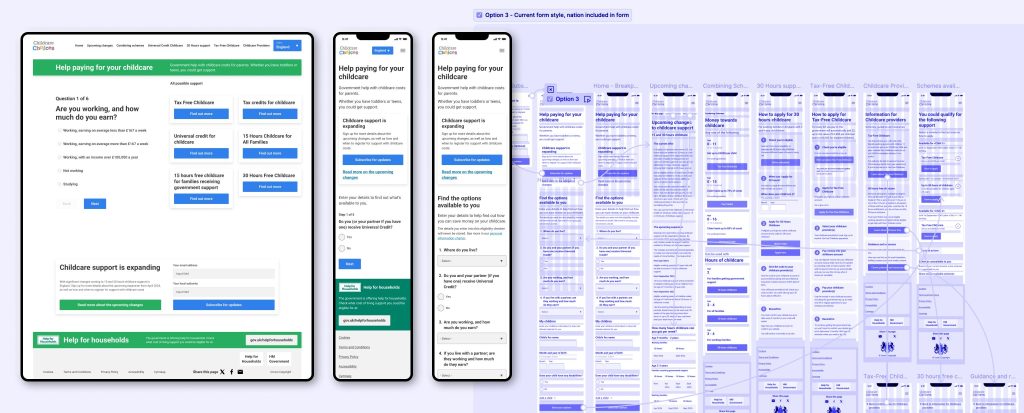
- Expanding desktop to mobile
- Accessibility
Background
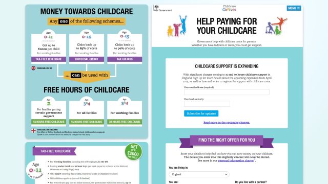
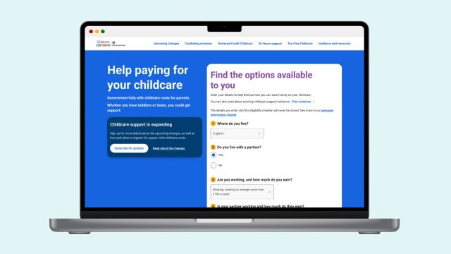
It aims to be a one stop shop that brings all benefit offers into one place rather than multiple places across the gov.uk. Making the experience more user friendly.
The site caters to two main type of users:
- Parents. They use it to understand what benefits are available to them and when to apply depending to their situation and the age(s) of their children.
- Childcare providers. They use it to understand the existing benefits and guidance on how to apply them in their business; also, to access resources that will aid them to promote the existing benefits with parents.
However, by the end of 2023, and with new childcare benefits becoming available to the public. The site was not meeting user and business needs and needed to be updated to meet accessibility standards.
The goal for the UK Government was to have brand new Childcare Choices site accessible to everyone by April 2024. Big Blue Door (BBD) design team started the initial discovery and wireframe work in December 2023. I joined their forces in January 2024 to lead on the full redesign of the site, making it ready to start development by mid February.
The challenge
- Short deadline. Launch date was aimed to April 2024, reducing the whole design process to less than 6 working weeks.
- User testing on demo site. We couldn’t test the designs prior development. All decision have to be based on best practices and old user surveys.
- Transition the site to a new CMS. The new site is built in Drupal, which makes it easier to maintain and update by everyone. But a new CMS meant the timeline had to cater for training for the government team.
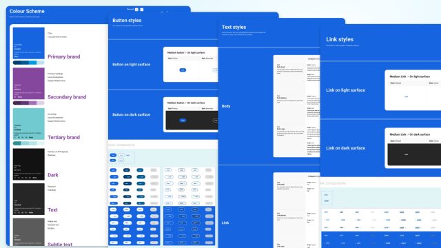
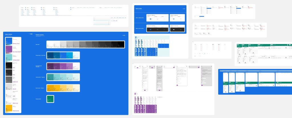
- Childcare Choices doesn’t have a defined brand. Extra UI and branding discovery work needed to be done before an initial wave of page designs. With only the logo to as a starting point, a Foundations library was needed to define: a new a font type (text styles and type scale), brand colours (passing accessibility contrast ratios) and overall spacing and styling rules.
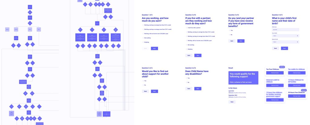
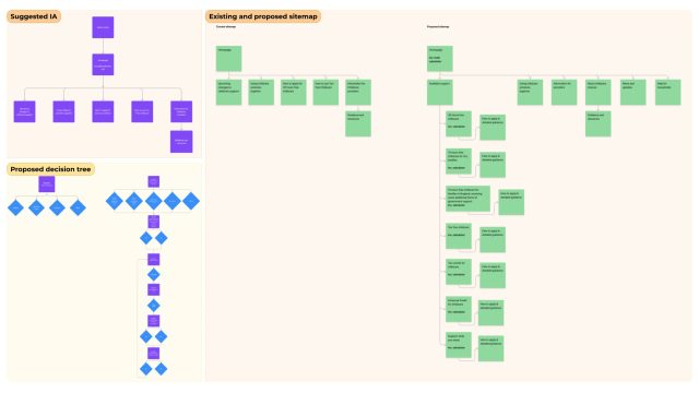
- Improve the sitemap and benefit calculator logic. All potential benefit results needed to be mapped to make sure the new tool would be able to showcase the right response for each individual user. Given the need to tailor information for each of the devolved nations of the UK, we explored various options for selecting a user’s nation. To streamline the form processes, we developed decision trees that guided our early design decisions. These decision trees were crucial in creating a simplified user experience. Meanwhile, the central government teams rewrote the content to ensure clarity and accuracy.
Process
- Childcare Choices site was not up to date with user needs and accessibility standards. Making it harder for users to find the right information, having to navigate to other sites to find answers. The site was not a flexible and agile tool, and sometimes showcased irrelevant information to the users.
- We needed to fix these issues and upgrade the UI with it.
2. Research and Insights
- I reviewed Gov.uk Design System and Digital Design guidelines and best practices for forms, typography and more, to get validated information that works on users.
- From some documents provided by the government team, we mapped all user journeys for each benefit scheme to build the logic for the decision tree tool of the benefit calculator. From this, the first wireframe prototype was built to share with Childcare Choices Government team for first round of feedback.
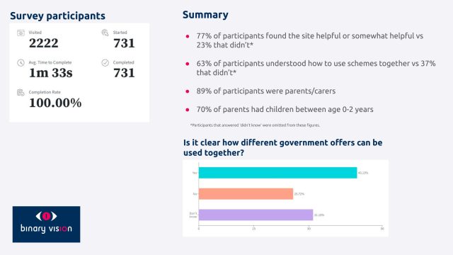
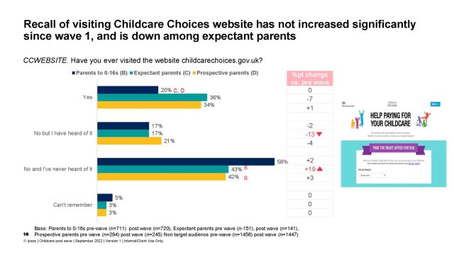
- I also collated any relevant point from previous website surveys (performed by Ipsos and Binary Vision), to validate user needs and review pain points on the experience.
- I started by sourcing and structuring all design elements, making sure those were meeting gov.uk guidelines.
- Reviewed all existing brand elements and simplified them to build a Figma foundations library (simplified Design System), that guaranteed the site will meet accessibility needs. This library would simplify any future update on the iterations after round of approvals.
- As the Childcare Choices government team was not familiar with Figma and design processes. I created a user scenario on a desktop and a mobile prototype, for them to review and feedback on the designs. It was easier for them to understand the functionality of the new components on a live-like prototype experience.
This step reduced the rounds of feedback between me and Childcare Choices team. It also helped to ease the delivery of all page designs to the development team, as they could see the intended functionality without much explanation. iterations after round of approvals. - After a couple rounds of feedback, I finalised the design of all pages and breakpoints, with all required assets. Making everything available for a smooth dev handover.
All design work met deadlines and was completed in 4 weeks.
4. Development
- Development work went smoothly, only facing short delays due to the calculator logic and some new content changes requested by Childcare Choices team.
- New site was being built on Drupal. Childcare Choices team required training in order to keep the content site up to date.
5. User testing
The primary objectives of the user testing were:
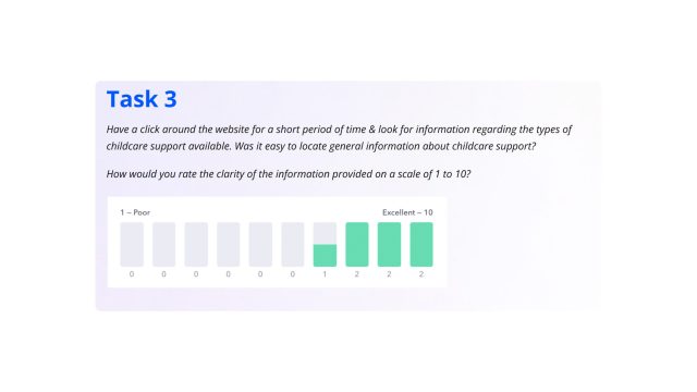
- Assess the discoverability of key informative sections: Observe how easily users can find information on the website.
- Evaluate the usability of some bespoke functionalities: Specific features unique to the website were being tested for intuitiveness, efficiency, and overall user satisfaction.
- Gather feedback on the look and feel: The website’s visual design, navigation, and overall aesthetic was being assessed to ensure it aligns with user expectations and preferences.
- Identify any accessibility issues: Particular attention was being paid to the website’s accessibility for all users.
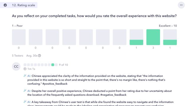
The methodology used was remote unmoderated usability testing. A diverse group of 5 individuals reflecting the demographics of UK residents was recruited via the testing platform ‘Userbrain’. The remote user testing was conducted on both desktop and mobile devices to ensure optimal user experience across all platforms.
The overall test feedback was very successful, with only some elements to consider that could be fixed before the site launch:
“Great website. Simple design and typography. User experience was very satisfactory – I never felt like I was lost or overloaded with information.”
Outcome
- Tight deadline. With the transition to a new CMS (Drupal) and having to do user testing on the developed demo site, the final launch date had to be delayed to meet all functionality expectations. New site launched on the 9th of May 2024, despite of being delayed by a few weeks, the new site has had a very good welcome from users and the government team in charge of the project.
- Simplified branding. The creation of a new accessible colour palette (maintaining the playfulness of the original palette) and assigning each colour a functionality has made for a cleaner interface. The new branding, and the way is used on the site, helps the user understand how to interact with the content.
- Technical build. The product was developed using Drupal, taking a modular approach to content management. The form, the main piece of functionality, is fully integrated into the CMS, allowing central government teams to easily edit it at any time. This modularity ensures the product can adapt as the policy landscape evolves.
- User-Centered Design. Prioritising the needs and behaviours of parents and guardians to create an intuitive interface.
- Accessibility standards. Ensuring that the website is fully accessible to all users, including those with disabilities. It has been crafted with usability in mind, as well as being 100% WCAG 2.1 level AA compliant.
- Seamless navigation. Implementing a user-friendly structure that simplifies the search for childcare options and support.
- Comprehensive Information. Providing clear, concise information about various childcare support schemes and eligibility criteria.
Contributors
- Eva Vañó Seguí – Senior Product Designer Contract
- Tim Peet – Senior Product Designer BBD
- Louwrens Erasmus – Product Owner BBD
