EE design audit - web and app
UX, UI, Design Collaboration
Role
Senior Product Designer
Timeline
1 month
Responsibilities
- Design audit
- Design collaboration
- Define design quality
- Mapping business goals
- Reviewing web and app
- Accessibility
Why EE needed an audit?
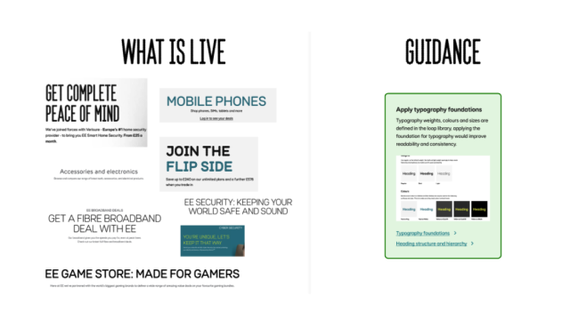
In August 2023 EE site was going through a complete rebrand and experience update. The design team was aware the end to end experience of site and app were not that coherent for the user.
An audit was needed to identify and raise valuable insights into the state of the website and app. We needed to evaluate branding, user interface, and user experience, to identify inconsistencies and areas for improvement.
This exercise was aimed as a strategic investment for EE Consumer Design Team to empower decision-making and sets the stage for long-term success in our digital products. Many works to address this issues were ongoing on the many teams, but we needed a centralised report to make sure all works were aligned.
The audit wanted to serve as documentation of what could be improved and how it could be improved. To identify the issues and propose changes, mapping everything to make sure no loose ends were left.
Goals
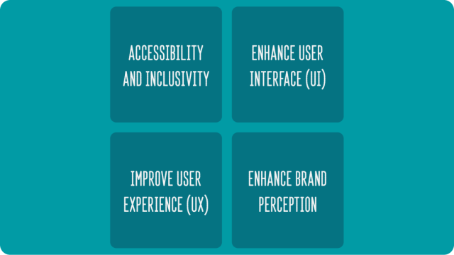
- Identify Inconsistencies
A design audit will help pinpoint inconsistencies in branding, visuals, and user interface elements across our website and app. Consistent design fosters trust and familiarity among users, which can lead to increased engagement and loyalty. - Improve User Experience (UX)
By evaluating the UX, we can identify pain points and areas that hinder the user journey. Addressing these issues can lead to a smoother, more enjoyable experience for users, increasing the likelihood of repeat visits and conversions. - Enhance User Interface (UI)
A design audit assesses the clarity, intuitiveness, and overall aesthetics of your UI. Improving the UI can make your digital products more appealing and user-friendly, reducing bounce rates and increasing user retention. - Enhance Brand Perception
Consistent and high-quality design communicates professionalism and reliability. With that we can ensure that our digital products align with the brand’s identity and values. - Accessibility and Inclusivity
Evaluating accessibility during the audit ensures that the digital products are usable by all individuals, including those with disabilities. As it was one of our OKRs to achieve better accessibility, it was important that the audit could help to uncover issues that were missed during launches.
How?
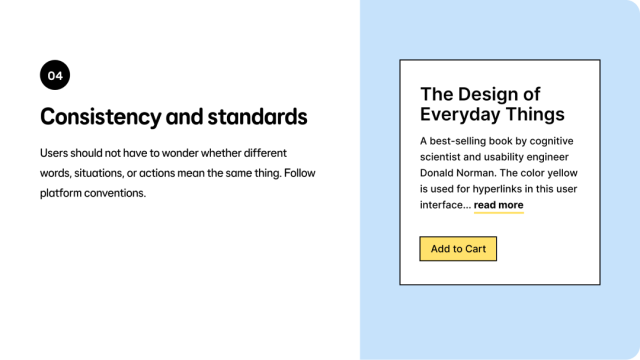
The evaluation was done using a mix of methods, including: design best practices, design principles and heuristics. All of this, to make it easier and faster to document issues and pint point solutions.
The aim was to not get stuck on rules of engagement. If we found something that was off, an experience that was not right, inconsistency between items, accessibility issues, anything that from the designers point of view could improve, we were to take notes of it and add a recommendation.
We had to pivot the analysis from a pinpoint modules and pages to a wider perspective on what could be improved from the foundation of what we were designing and delivering.
What we found
- Foundation usage
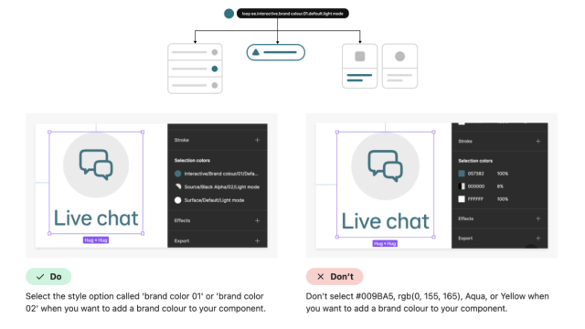
Design foundations are the basic atoms we need to create components, pages and to scale the design language for our products. They are the definition for: colours, typography, layout and tokens.
Not using the foundations correctly was creating a domino effect on all pages and products we were delivering. - Components usage
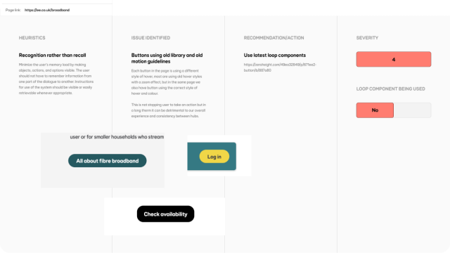
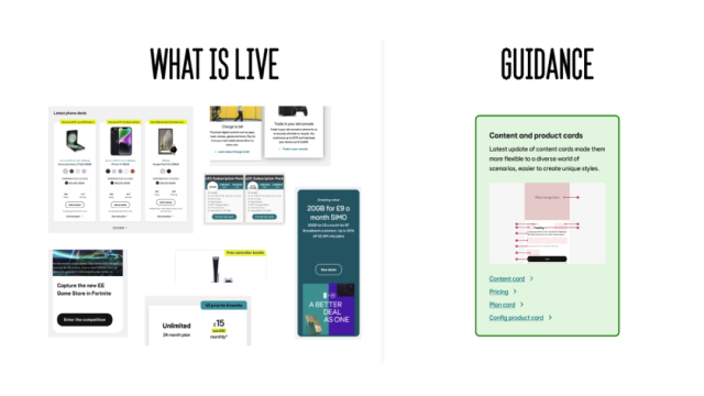
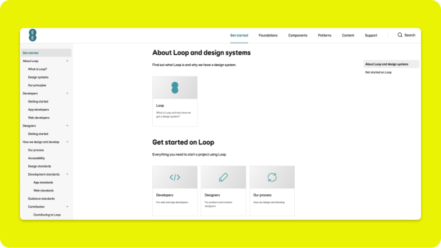
The EE Design System (Loop) components are reusable building blocks. We found in many scenarios those were not used correctly, which can make pages and entire flows look differently from other areas of the product.
It also was also creating usability problems for users. - Micro interactions usage
At the time, we did not have specific documentation for interactions, but by using foundations and components guidance we would avoid micro interactions inconsistencies. For example: sliders, carousel, overflow scroll, loaders and others.
Actions
With all things found, it was clear designers and engineers needed to improve visual decisions and communicate inconsistencies more effectively. The size of the design team had grown so much and very fast, which meant there were too many channels and not enough ownership of findings.
There was a need to streamline process and ensure everyone was on the same page:
- Define better ways of working.
- Add design checks during development process.
- Design system usage checks.
- Improve production QA.
- Improve communication for design queries.
- Better collaboration between Product Owners and Designers to identify all these issues.
- Define a design quality % where if not met project will need a dev revision.
Impact
Over the course of the next few months, and while all new products and experiences (web and app) were being launched. There was a push to enhance Loop design system even more, based on the recommendations of the audit.
- To bring the main Figma design component libraries to parity with what developers were using. To make designers and developers stay in sync using the same guidelines.
- Expand the knowledge of what the use of the Design System can do on the designer way of working. Enhancing collaboration within squads and between other squads.
- To start applying some of design guidelines and styles on the legacy pages to make transition to new designs smoother for the users.
- To make all experiences accessible, all Design System components to meet Web Content Accessibility Guidelines (WCAG) 2.2 AA standards.
Contributors
- Rich Chong – Design Lead
- AJ – Principal Designer
- Eva Vañó Seguí – Senior Product Designer
- Muhammad Akram – Senior Product Designer
- Jacob Mincher – Product Designer (Design System)
- Jakub Ters- Product Designer
